Aiken Philharmonic
July 2026
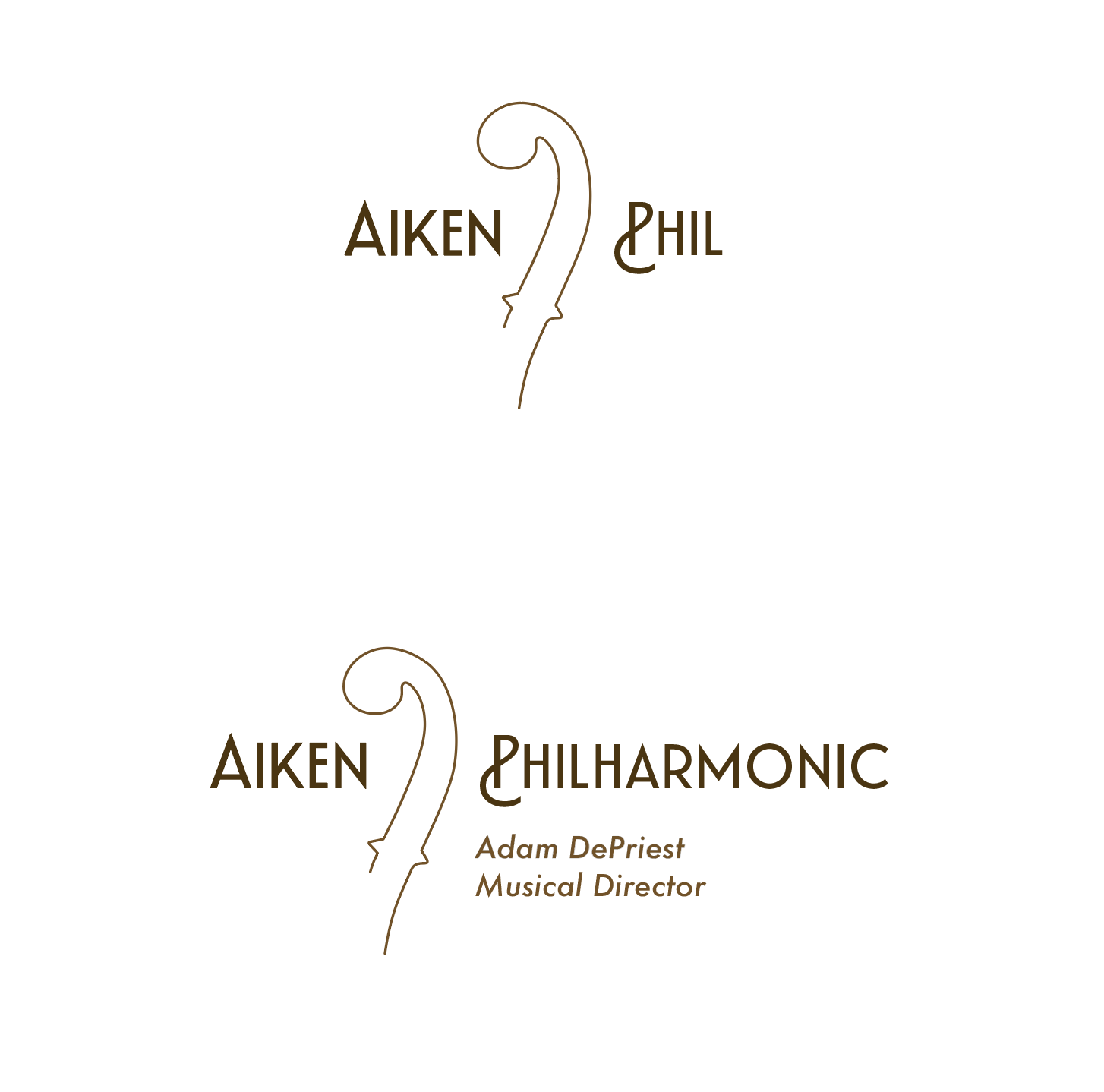
A cultural staple in the community needed a new recognizable look to promote its upcoming season. In collaboration with the music director and board, I designed a new brand system for the Aiken Philharmonic.
Team
Musical director and marketing team
Deliverables
Logo and variations, brand guidelines
Process to the identity
For this project, the team wanted something that was simple, refined and wanted to highlight some musical element.
The logo was inspired by the f-hole of a string instrument, I mocked this particular version off my personal violin.
I paired the graphic with angular text to play off the very flowly and circular feeling of the f-hole. For color, I went with a green palette chosen, inspired by conversations I had with the marketing director about the town’s historic tree-lined square.